REVISITING THE IDENTITY- ADDING SOLIDITY TO THE INHERENT PLAYFULNESS
The brand name had lightness to it, which was in line with what we were building. I just added a bit of solidity and a modern look to the visual identity. I also created a visual system which both signaled the wide-range and gave it a singular, distinct look.
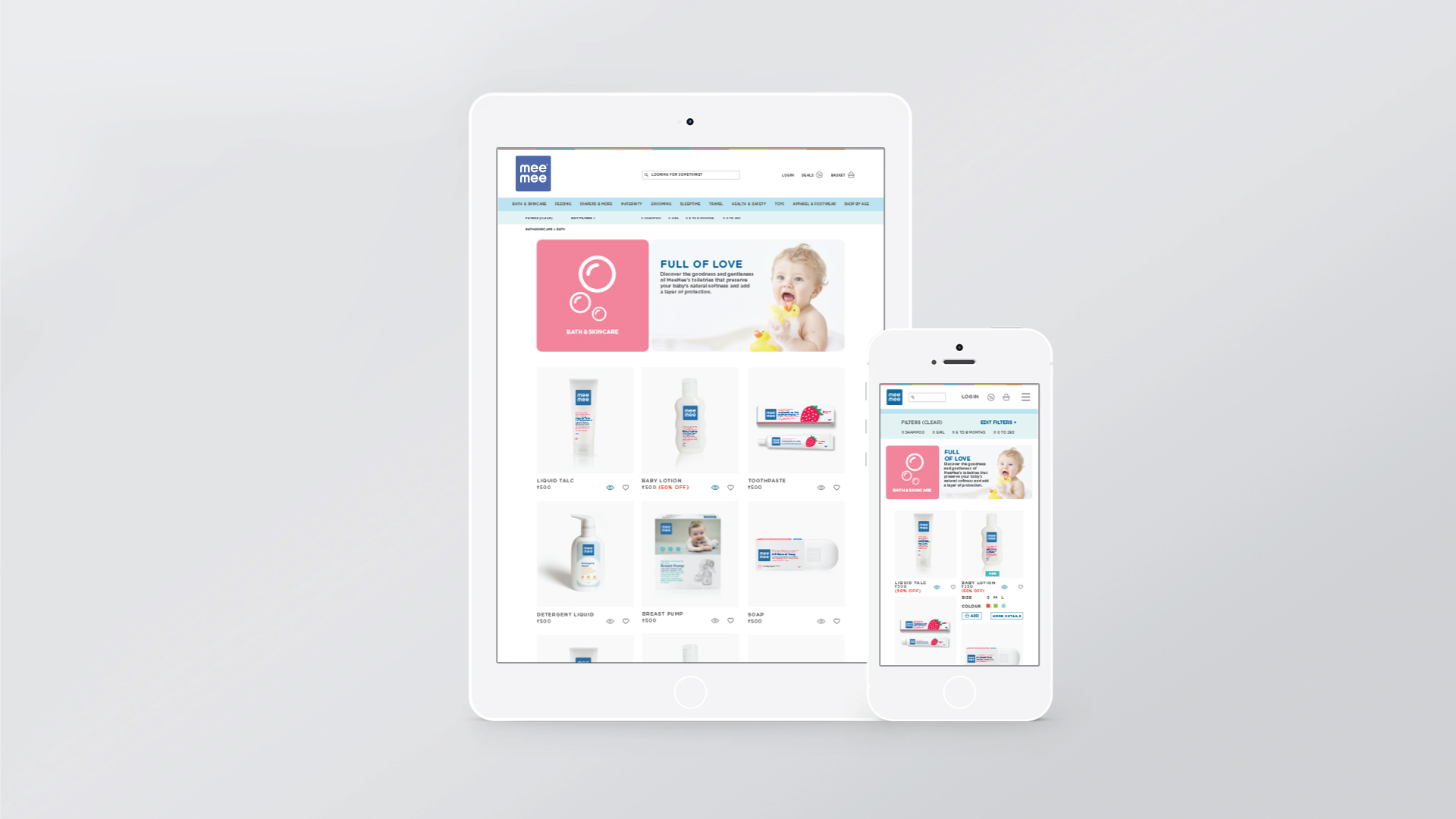
IMAGINING THE E-COMMERCE EXPERIENCE FOR A SLEEP-DEPRIVED MOTHER SHOPPING AT 2 AM.
Online shopping is big for mothers. However, e-Commerce experience is about the clutter of choices, and clutter does not work when you are talking to tired and sleep-deprived mothers. We re-imagined the experience – with a mobile-first website, which was designed to be the most stress-free destination for her.


