India is full of iconic food gems. However, the best of these savories are only available in their pockets of origin. Lotus House, a retailer with presence across major airports in India, wanted to launch a brand that brought together all the authentic savories under one roof. The brief was to bring alive the nostalgia associated with these often lost behind, but much cherished flavors.
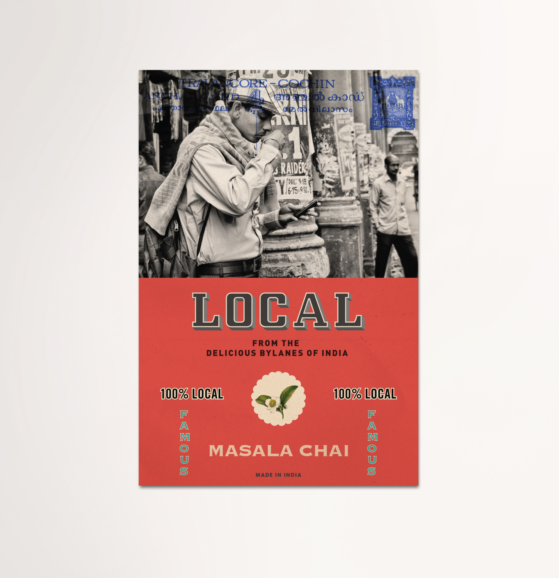
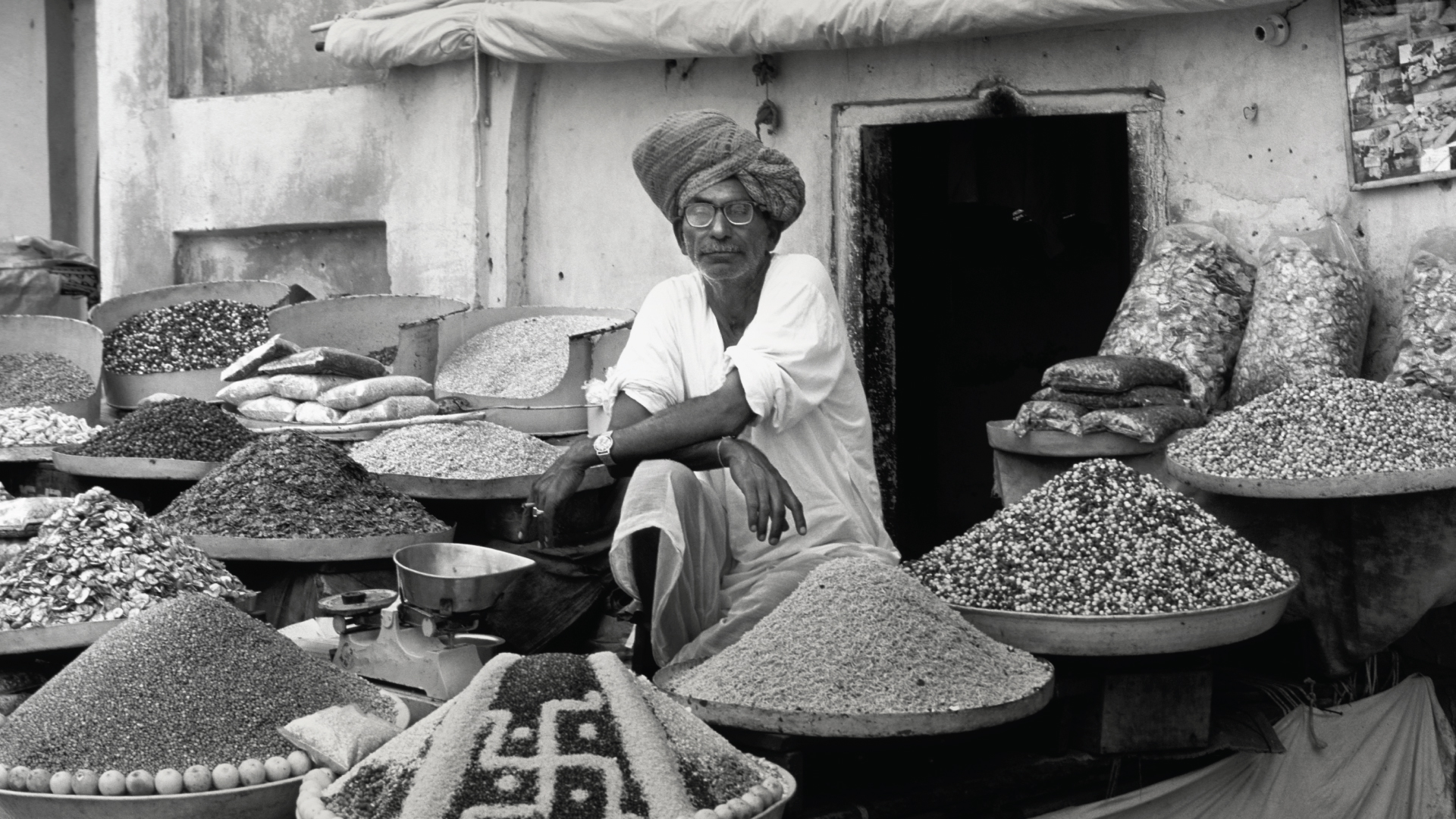
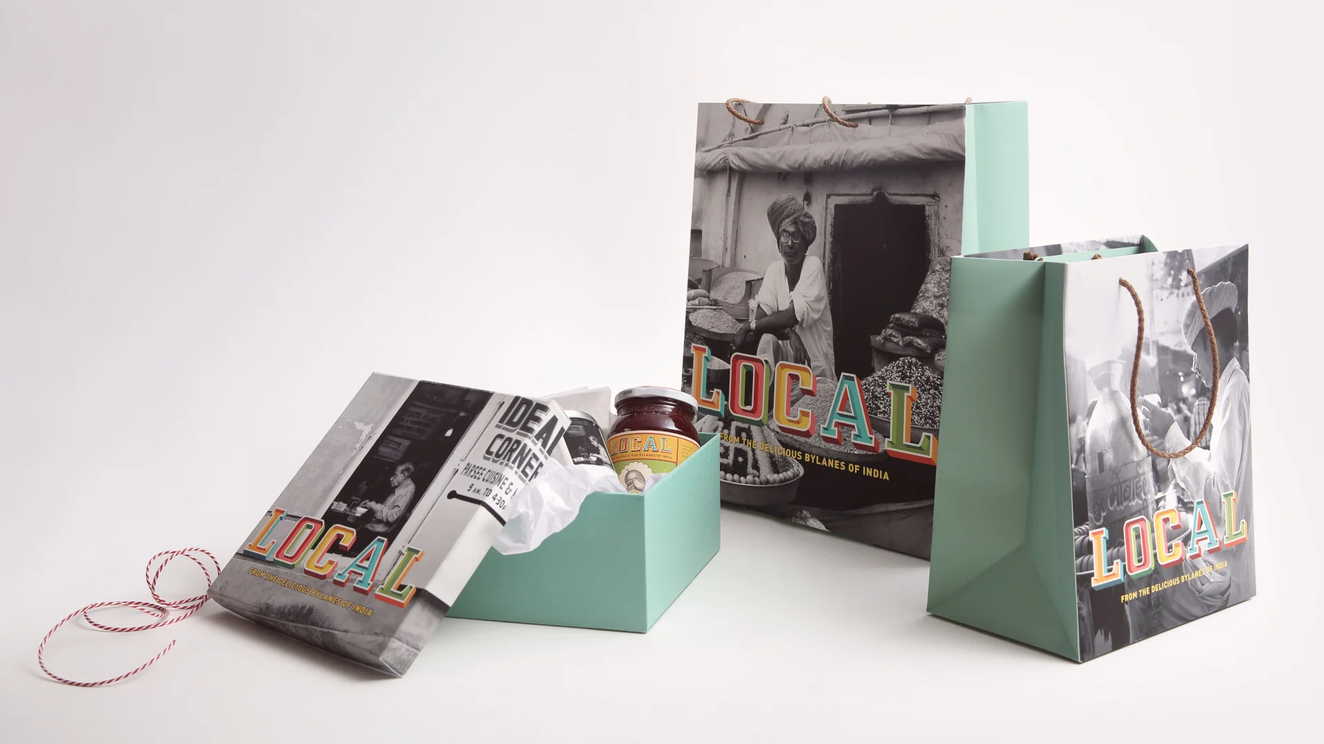
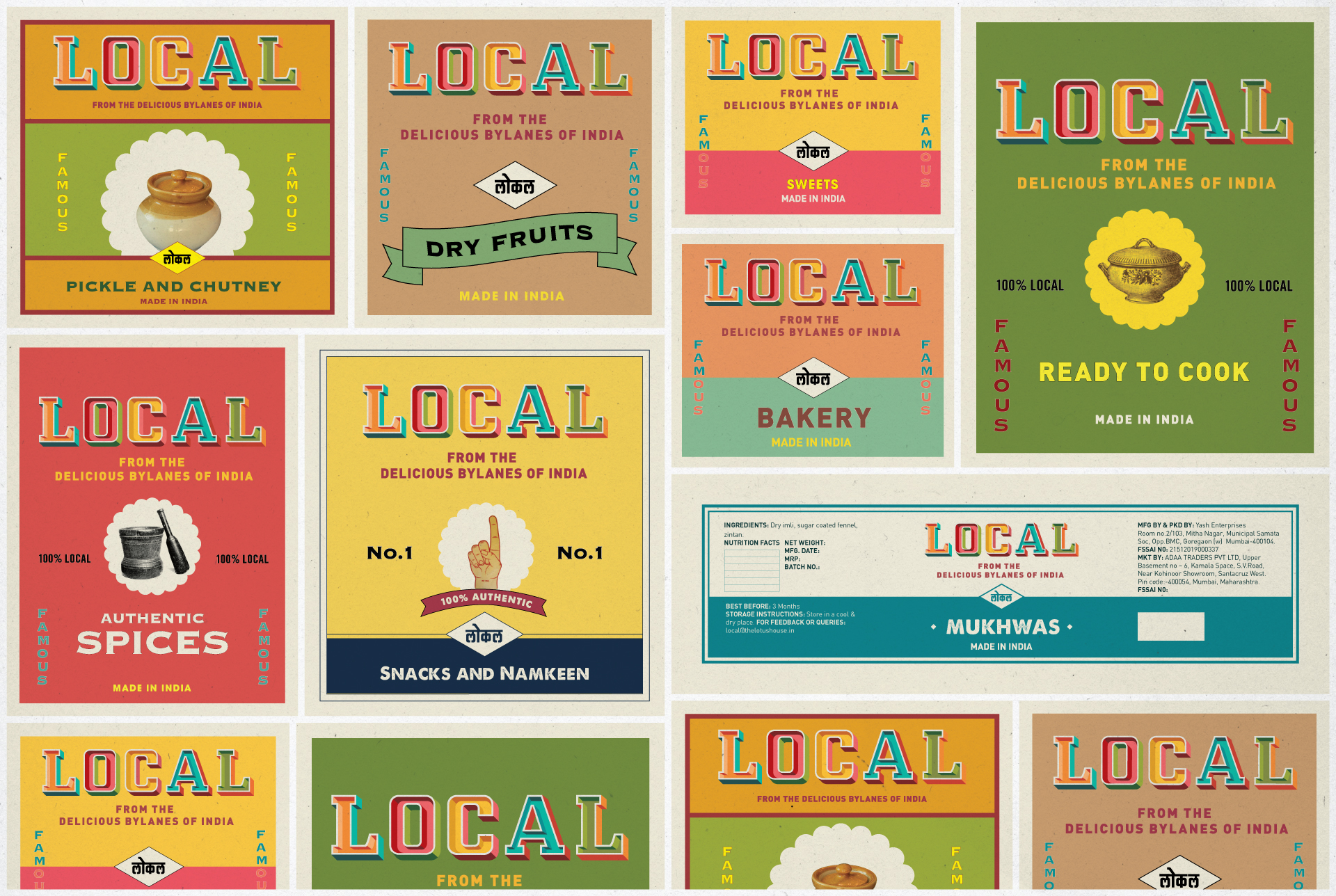
The brand had to be a walk down the bylanes from where these flavors come from. We called it ‘Local’ - a word that stands for authenticity and belongingness. The visual world was inspired by the traditional signages and color palette that are (now) part of our memories. The typography was inspired by the lost tradition of hand-painted lettering. Imagery that depicted nostalgic moments, was used for the backdrop.


